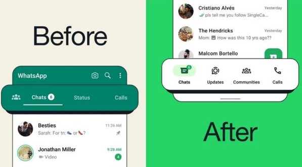
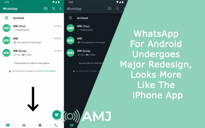
WhatsApp for Android has undergone a significant transformation, looking similar to its counterpart on the iPhone platform. Initially teased about a year ago, the redesign has finally come to fruition. The new design features the navigation bar at the bottom of the screen, akin to the layout found on iPhones.
It is said that WhatsApp is redesigning the Android version of its app to enhance user experience and accessibility. The relocation of the navigation bar is expected to streamline navigation and improve ease of use, particularly for Android users accustomed to different layouts.

Like any significant overhaul of operating systems or applications, major changes are often met with resistance. A prime example of this is Google Maps’ recent redesign. Last year, Google revamped its primary navigation app, opting for new color schemes similar to those seen on Apple Maps for the iPhone. This redesign sparked considerable criticism, but Google proceeded to implement the new design across both Android and iPhone platforms.
This decision to redesign WhatsApp for Android follows a broader trend in tech redesigns. While the changes to WhatsApp may not be as drastic, they signify a major shift towards uniformity in design across various devices.
The revamped navigation bar features familiar tabs, including Updates, Chats, Calls, and Communities, along with minor adjustments in spacing and order. The addition of the Updates tab, replacing Status, aims to maintain functionality while aligning with the updated layout.
Despite initial resistance, users are encouraged to get used to the changes, as delaying updates only postpones the adoption of new features and improvements. In addition to that, the latest version of WhatsApp for Android introduces enhancements to the screen-sharing feature during video calls. It now allows users to share audio alongside screen content. This is something that was previously not possible on WhatsApp.
WhatsApp unveiled its latest update on 28th March 2024, emphasizing enhanced user accessibility by relocating navigation tools within easy reach of the thumb. Alongside this adjustment, the redesign introduces new icons for each tab. It also features a lighter green accent to denote notification counts. This new colour scheme perfectly aligns with the signature WhatsApp icon, thus, contributing to a unified visual experience.
As WhatsApp continues to evolve its interface, users can anticipate a more cohesive experience across platforms, reflecting the app’s commitment to innovation and user satisfaction.


![Index of Money Heist [Season 1, 2, 3 & 4 – All Episodes, Cast and Plot] Index of Money Heist](https://www.asiamediajournal.com/wp-content/uploads/2021/05/Index-of-Money-Heist-3-100x70.jpg)